How to use -ms-high-contrast
NOTE: This content is now outdated, I recommend referencing Microsoft Edge's blog post about the standardized solution
This post is in response to Patrick H. Lauke's post titled, Windows High Contrast Mode: the limited utility of -ms-high-contrast. Since this is a response post, I recommend reading his first and then come back to read this, I'll wait.
I mentioned in the twitter thread that I'd try to find some time to blog about this to help clarify how it works since it wasn't mentioned in his post, well I finally found some time.
Why the media query exists
The high contrast feature within Windows is designed to help people with contrast sensitivity issues. The colors are propagated from Windows High Contrast into the site's style to ensure that the site is offering a true high-contrast experience similar to other applications on Windows.
This is different from other browsers where they do graphic modifications to the site such as color inversion. For example, here is Google Chrome with High Contrast enabled compared to Edge with Windows High Contrast on the same site:
This route is beneficial for another reason, since we are modifying the styles this allows us to offer
control back to the web developer via the -ms-high-contrast media query so they can further improve the experience
for their users.
It's about UX, not design
A common misconception that I've seen often with this media query is that people want to be able to make site changes by knowing which colors were selected by the user.
While the feature has to do with color modifications it's sole purpose is to aid in providing users with contrast sensitivity a better experience. As such, you shouldn't necessarily care about what the specific color is. To some extent, you shouldn't even care how your site looks; but how it functions in high contrast.
Note: I am not a designer, and I'm sure some designers will read this and inform me that UX is a part of design. That's fine, but for the scope of this article please allow me to stretch the definition of design to be separate from UX.
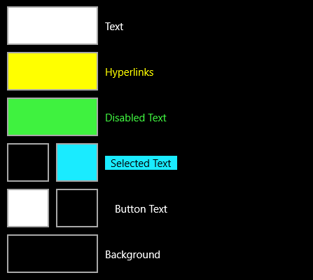
To make this easier we mapped the Windows High Contrast colors to CSS system color keywords so you can utilize the specified colors without needing to know them.
- Text is mapped to
windowText - Hyperlinks is mapped to N/A, we apply the color to
<a> - Selected Text is mapped to
highlightText&highlight - Button Text is mapped to
buttonFace - Background is mapped to
window
Here's a screenshot of the Window High Contrast options as it will make the above more clear:
There are three values for the media query, active, white-on-black, and black-on-white.
Here is basic usage of the media query.
@media screen and (-ms-high-contrast: active) {
    /* All high contrast styling rules */
}
@media screen and (-ms-high-contrast: black-on-white) {
    /* Rules for users using black-on-white */
}
@media screen and (-ms-high-contrast: white-on-black) {
    /* Rules for users using white-on-black */
}
Enough background - let's get practical
All of the above is a good primer, so let's take a look at some practical examples and how to utilize the media query to achieve great results for your users. All of the examples below are based on real sites I've seen break when in high contrast mode, so if you're doing the below - please update your site.
Note: for simplicity purposes, in each of these demos I'm only showing the final state that causes a broken behavior and how to fix it, not a fully functional implementation of said solution
Custom checkbox images
This is a common scenario I've seen. You want to provide your users with consistent graphics for checkboxes or you just don't like the look of the browser provided ones. So you hide the checkbox and provide your own. Here is an example of this without high contrast enabled.
See the Pen custom checkbox without -ms-high-contrast by gregwhitworth (@gregwhitworth) on CodePen.
Now if I turn on white-on-black high contrast, let's see how this experience changes:

The checkmark completely disappears due to its alpha transparency and the background being switched to black provide high contrast in other areas. The image itself is still there, but there is no way to see this. So, what can we do to fix this. Well, there are two options:
- Create a high contrast icon to begin with
- Switch out the background image using the
-ms-high-contrastmedia query
Create a high contrast icon to begin with
This should be considered best practice in my opinion, any icon that you're creating should have high contrast. There are numerous tools to help you ensure that the colors you're using meet the guidelines produced by WICAG for high contrast. I usually use the WebAIM Color Contrast Checker but there are many great ones to use. So let's assume that the checkmark has to be black to match the rest of our site, we can ensure high contrast by including the background with the image.

Yes, it isn't the best design, but that's not the point. The user can now see all of the content that a person without contrast sensitivity can. If you're able to design a style guide for your site that takes into account high contrast, you could make the checkmark stand out even more by making it green. Again, the goal here is functionality, not form.

Using system colors for dynamic color propagation
Rather than building up numerous images, one can utilize the mappings I referred to above. Let's take a look at a poorly executed SVG chart, first the intended look for people that don't have contrast sensitivity.
See the Pen SVG chart without high-contrast solution by gregwhitworth (@gregwhitworth) on CodePen.
We could improve this for our contrast sensitive users by adding the following:
@media screen and (-ms-high-contrast: active) {
    .axis,
    .bar {
        stroke: windowText;
    }

    .box {
        fill: window;
    }

    .bar {
        fill: highlight;
    }
}
Here is the result in both the White and Black high contrast modes:


There is more that could be done here to further improve this chart, but I think you get the point.
Takeaways
Like so many things on the web a lot can be done for all users that also results in aiding users that have contrast sensitivity issues. Here is an excellent talk by Aaron Gustafson about Inclusive Design which covers this.
High contrast tips:
- Try to make icons high contrast from the beginning for everyone, if you can't
utilize
-ms-high-contrast: activeto provide high contrast versions - If you have alpha transparency, use
-ms-high-contrastto add in a background to ensure high contrast - Utilize the system color variables in order to utilize the colors selected by the user to provide a great high contrast experience in any scenario that takes CSS colors.
If you have feedback on this post, feel free to contact me on twitter