Can we please style the <select> control?!
When working in Product Management one important aspect to determine the importance of a bug or feature in the product is how the person responds to the question or task you have them do. People give off many emotions, even subtle ones, that help you determine relative priority of potential work items. In my previous post regarding the native browser Controls & Components, I saw frustration at forms and controls in general, but goodness the <select> control got the brunt of the hate. One specific item of feedback I got in this survey which points to this passion and also to the opportunity here is summed up in five words, *"Don't f@k this up more." (read more quotes here)
Let's start digging into the data, beginning with the breakdown of demographics of who answered the survey:
In this survey, we asked a similar question regarding what type of projects that you normally work on; but we added a new section to understand the reach of your largest web project. More on why we asked this a bit later.
From this data we can adequately derive that we have a decent sampling across experience (although fewer beginners than I'd hope), project type and project scale. This is important because we want to ensure that we’re taking everyone’s feedback into account. The person working directly with React/Vue/Ember/Angular to build out their own <select> replacement will have a completely different set of “wants” versus the users of those components or developers using the built-in <select>.
<select>, oh, the lowly <select>
Jumping into the deep end of this, we asked what you found MOST frustrating when working with the <select> control, and I’ll admit I was kind of surprised at the top one:
| Frustration | % | Count |
|---|---|---|
| Not being able to create a good user experience for searching within the list | 27.43% | 186 |
| Not being able to style the <option> element to the extent that you needed to | 17.85% | 121 |
| Not being able to style the default state (dropdown arrow, etc.) | 14.01% | 95 |
| Not being able to style the pop-up window on desktop (e.g. the border, drop shadows, etc.) | 11.36% | 77 |
| Insertion of content beyond simple text in the <select> control or its <option>s | 11.21% | 76 |
| Insertion of arbitrary HTML content in an <option> element | 7.82% | 53 |
| Not being able to create distinctive unselected/placeholder style and behavior | 3.39% | 23 |
| Being able to generate new options from a large dataset while the popup is open | 3.10% | 21 |
| Not being able to style the currently selected <option>(s) to the extent you needed to | 1.77% | 12 |
| Not being able to style the pop-up window on mobile | 1.03% | 7 |
| Being able to have the options automatically repeat on scroll (i.e., if you have an list of options 1 – 100, as you reach 100 rather than having the user scroll back to the top, have 1 show up below 100) | 1.03% | 7 |
While it did surprise me that the top pain point was not “Being able to create a good user experience for searching within the list”; the rest of it aligned with what I would have expected. All of the questions above can fit into three different categories, by placing them into their buckets it can further help us understand the category that will provide the largest impact if solved.
This is important for us to understand because each of these categories requires its own investigation as there are numerous ways in which we could go about solving each of these problems and their subsequent sub-problems. Take the top pain point for example of “Being able to create a good user experience for searching within a list.” There are many ways in which we can try and solve this problem, but the two that immediately come to mind are the following:
- A new HTML control with search built-in and an improved develop UX for how the search behaves
- Provide extensibility of the built in <select> so that the web developer can insert their own “searching component”
We could do one of them, we could do both, or we could do something else; but I say this merely to point out that the searching issue itself will need to be investigated to ensure that we create something that will be used and cover the majority of use cases.
Looking at the categories of issues, we understand the largest area of frustration is styling. But let’s try to get an understanding of end user impact. As you may recall from the previous survey results; one of the reasons we're wanting to solve this problem is to improve both the developer experience AND the user experience.
Here's a breakdown of the top 5 frustrations pivoted on estimated weekly user visits to a given web project.
What I find interesting about this is if you click the legend items for the various segments the priorities slightly adjust. For example, the top pain points for projects with greater than 100 million visitors per week is styling the default <select> arrow/button and inserting non-text based content into <option> elements.
And since we know that frameworks and design systems have a broad reach as well, let's look at their breakdown as well:
I found this interesting as well due to the fact that the top pain point overall is not searching the select. All of the pain points above that, by a decent margin, is about styling and non-text based content in <option> elements.
Most commonly used dropdowns
We provided images of a variety of <select> and dropdown components from across the web, and all of them help hint to the above buckets of issues. This also allows us to get a general understanding of the more common use cases to ensure that we’re prioritizing the most impactful work up front. Here were the top five selected dropdowns that respondents said they use the most often in their web projects:
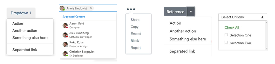
Of the top five used, the following can be derived:
- All of them will need complete styling of everything of the control
- Three of the five will require the capability to insert non-text content
- One of them will require behavior and interactions among sub parts.
As we can see, there are many areas within each of these buckets that we'll need to investigate; but these provide us with a good understanding of what web developers and designers should be able to build using the improved <select> or they won't use it.
Overloading <select>
Some folks correctly noted that some of the <select> options that could be chosen were not something they would consider to be a semantic <select>. And I can buy that argument, but one thing we’re trying to do in this is to not assume anything with regards to this content. If you look at popular design frameworks across the web, some of the most popular do not have a <select> component but a dropdown component that can be modified to either be a select, or even more complex than that. As such, we’re wanting to understand this further.
This does not imply that we’ll be advocating for web developers to utilize the improved <select> element for generic dropdown containers. This information though can inform a new component that does have a basic semantic meaning but provides a lot of the same functionality that a <select> contains since the user experience of a <select> control and dropdown are so similar.
Any additional thoughts?
The final question we asked is if there were any additional thoughts, below are a few that I found interesting and my initial thoughts around them.
"Expose a “toggle” event or “open”/“close”..."
This is a great point, and based on styles being one of the top requests I foresee us needing some solution for this, but we'll need to look into the primary use-cases for this.
"Introduce a dropdown element separate from the form semantics, which can be used for various purposes."
Completely agree, as I tried to portray in the section above this is why I added in some examples that aren't necessarily semantic <select> controls since the user experience overall is so similar. This is probably something we'll do.
"One thing that I've found very hard when rolling my own is positioning in a manner that doesn't take the dropdown out of the canvas. Maybe something that automatigally makes the dropdown go to where there is space would be super helpful (as the native select already does)"
I love that this was raised. I can say up front, that any <select> control that is built will have that same positional awareness. That said, we've been discussing if we should potentially explore API solutions in addition to the primary pain points to make a solution for this easier. As noted though (I'm beginning to sound like a broken record), that will need it's own investigation and probably won't block on the other work we do. Another one that fits into this bucket is how the built-in <select> always renders on top of all content. At any rate, we'll keep looking into these areas and will reach out to ensure that we're solving the right problems in the right way.
Next Steps
We’ll begin peeling the onion of styling a <select>. We first need to understand the current reasoning of browsers in why they limit the styling of the <select>.
One reason we’re already aware of is that desktop based <select> elements are able to escape the browser UI. Keeping this and still offerring complete styling isn't possible as it introduces a security risk. Because of this we'll want to first understand how important this capability is to end users and compare that with limitations this capability creates for web developers, which ultimately impacts end users as well. We'll be adding telemetry to get an understanding of how common this is hit by end users, I'll share that data at a later date.
Want to help out or keep track of progress?
We know form controls have long been a pain point for web developers and we’d love for you to give us your feedback as we go down this road. We’ll be working in the OpenUI repo on these investigations and as we begin creating proposals for new APIs, we’ll begin initial feedback and incubation there.
Also make sure to follow me (@gregwhitworth) and Nicole Sullivan (@stubbornella) on twitter as we keep people updated on the progress of this work.

Click here to view the full survey results